Mark Woodman Design+Color LLC
FCW: What do you see as the next big color story for 2017?
Woodman: I’m anticipating green as a big story. It’s more health-based and is an exciting change for consumers. It will not be just one green, but a range, from yellow-influenced to deep spruce. The dark values will be a refreshing surprise. They are cool and luxurious, natural and sturdy, so they accomplish a lot for one deep hue.
Gray is still being embraced by consumers and those that have already brought it into their living spaces will add its nuanced influence to other colors. The spruce I mentioned earlier, for instance, will have a silvery cast to it, as though a frost had blanketed an evergreen forest. In other hues, they will have a slightly muted appearance.
FCW: What color trends will you use in your upcoming design projects?
Woodman: I need to balance trend forward colors with real life, and what is actually available. I have been a proponent of navy blue for some time and finally its time has arrived, and big! I love working with this rich hue that is classic, modern, natural and enveloping. Christian Dior said, “Midnight blue is the only color that can ever compete with black.”
A hue that often evades us is camel. It can’t be too yellow or too red, but when you find it, it’s brilliant. I think it’s something to watch out for in the future.
Wool textiles are perfect for it and it’s one of the times that I’ll have a paint matched to a coat.
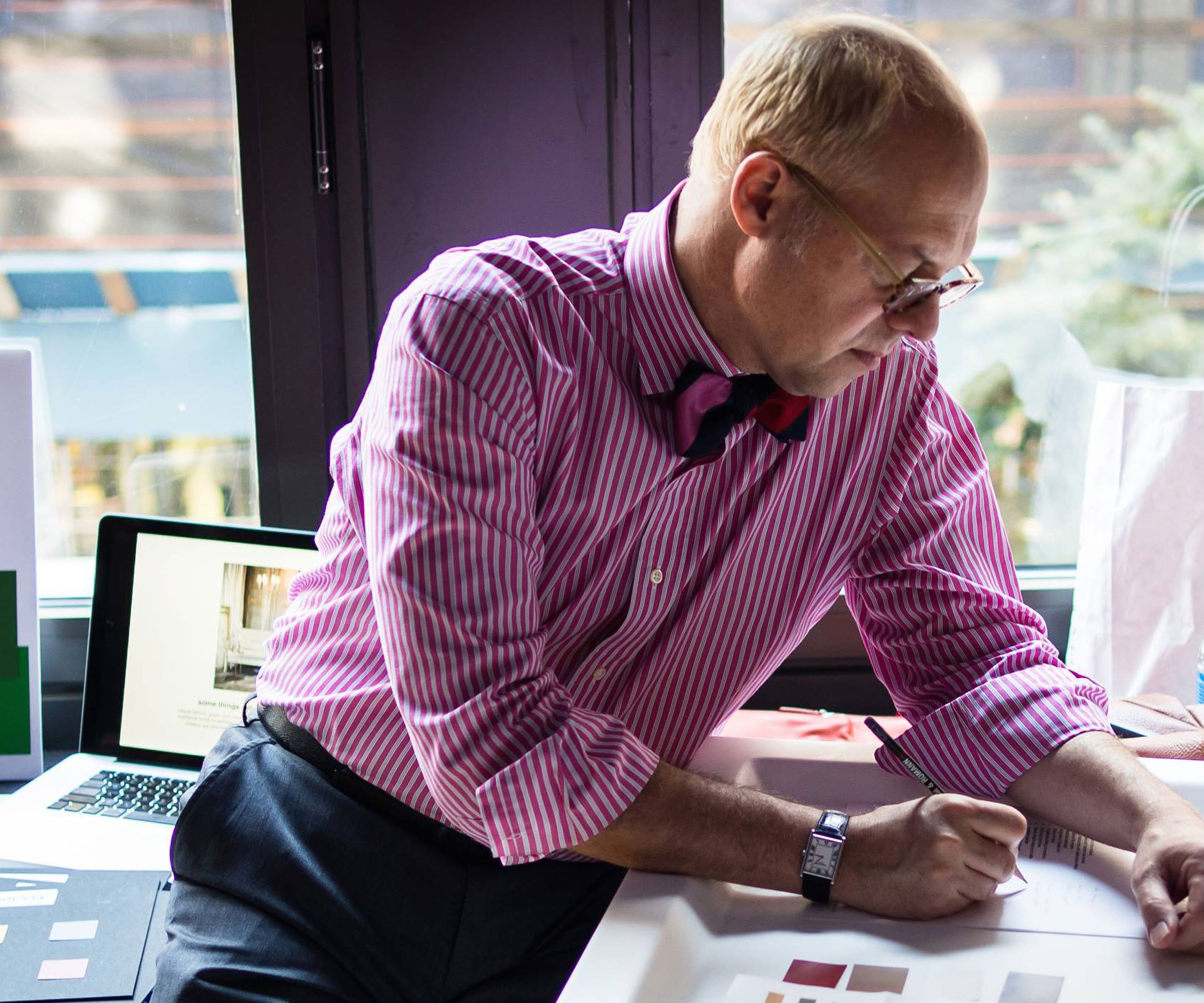
FCW: What is your “signature” color?
Woodman: It’s probably pink. It’s a healthy color that can also be daring and a little subversive. It’s just fun. Blush pink with gray and chocolate always feels fresh. Bright pink with navy and kelly green always has a prep vibe, and hot pink with black and white creates an almost Warhol graphic look. For my clients, though, my signature is more the surprise color, something they wouldn’t have considered.